Coconut water on subscription - with the deposit counted and every order sent straight to the warehouse.
Online shop · Subscriptions · Integration
COCONAUT® (Quest Food)
Since July 2026 · launching soon
Development · Integration
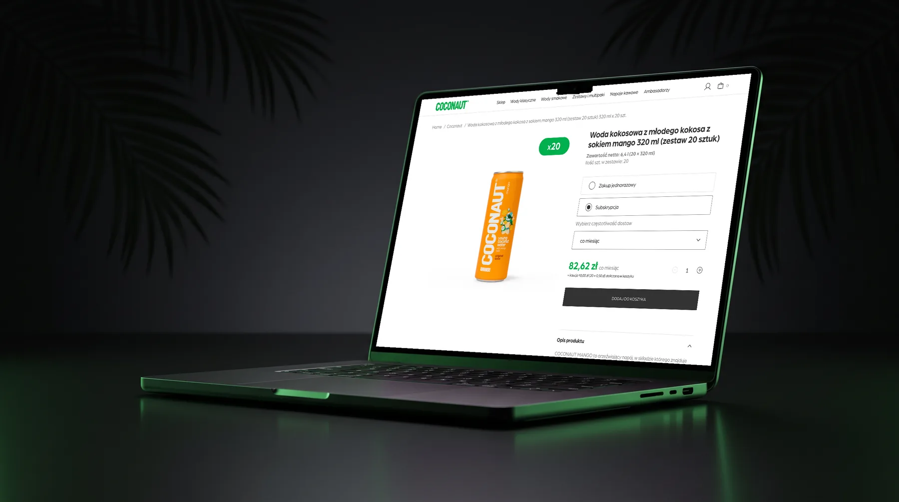
The film
One case of coconut water, every month - the new COCONAUT® shop in just over a minute.
At a glance
For COCONAUT® - a Polish coconut water brand - I built a new online shop that replaces both the old shop and the old brand website: subscriptions, the can and bottle deposit counted for the customer and every order handed to the client’s order system in exactly the shape the warehouse already knows.
01 - The problem
A drink people buy every week was sold through a shop built for one-off orders.
COCONAUT® sells coconut water in cartons, cans and multipacks of 6 to 24. The brand had two separate places online: a website with the blog and a shop on a hosted platform. Neither of them knew about subscriptions, and Poland’s new deposit return system meant that every can and bottle now carries a deposit that has to be shown, counted and passed on correctly.
The brief for the new shop: one place for the brand and the shop, built exactly to the designer’s mockups on desktop and mobile; subscriptions that customers can switch on with one click; the deposit and free delivery calculated before anyone reaches the checkout; and the legal requirements from the client’s food-law review built in.
And one condition that shaped everything under the hood: nothing could change for the team behind the shop. Orders already flow from the old shop into the client’s order system, then to the warehouse, invoices and parcel labels - and an order from the new shop had to arrive there looking exactly the same.
02 - The vision
The shop does the maths. The warehouse doesn’t notice the move.
Three principles drove every decision:
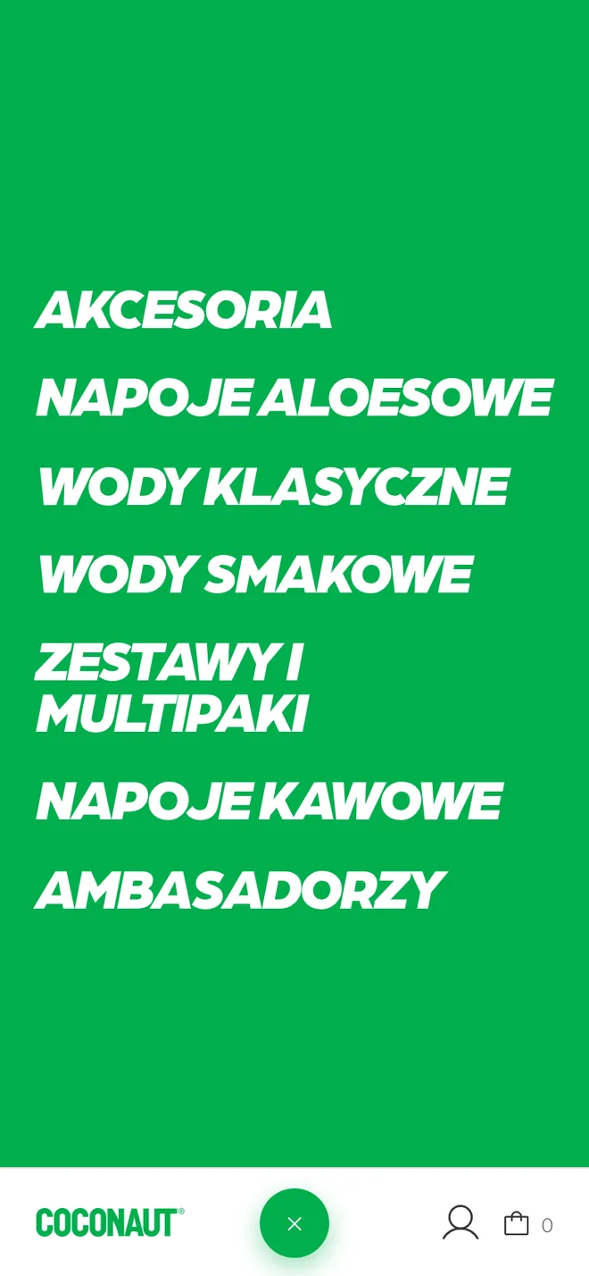
- Exactly like the mockups. Every screen follows the designer’s files on desktop and on a phone - including the parts the mockups only hinted at, like the shop listing, the checkout and the customer account, built in the same visual language. On a phone the navigation sits at the bottom of the screen, within reach of a thumb, and the menu spills out of the button as a green circle.
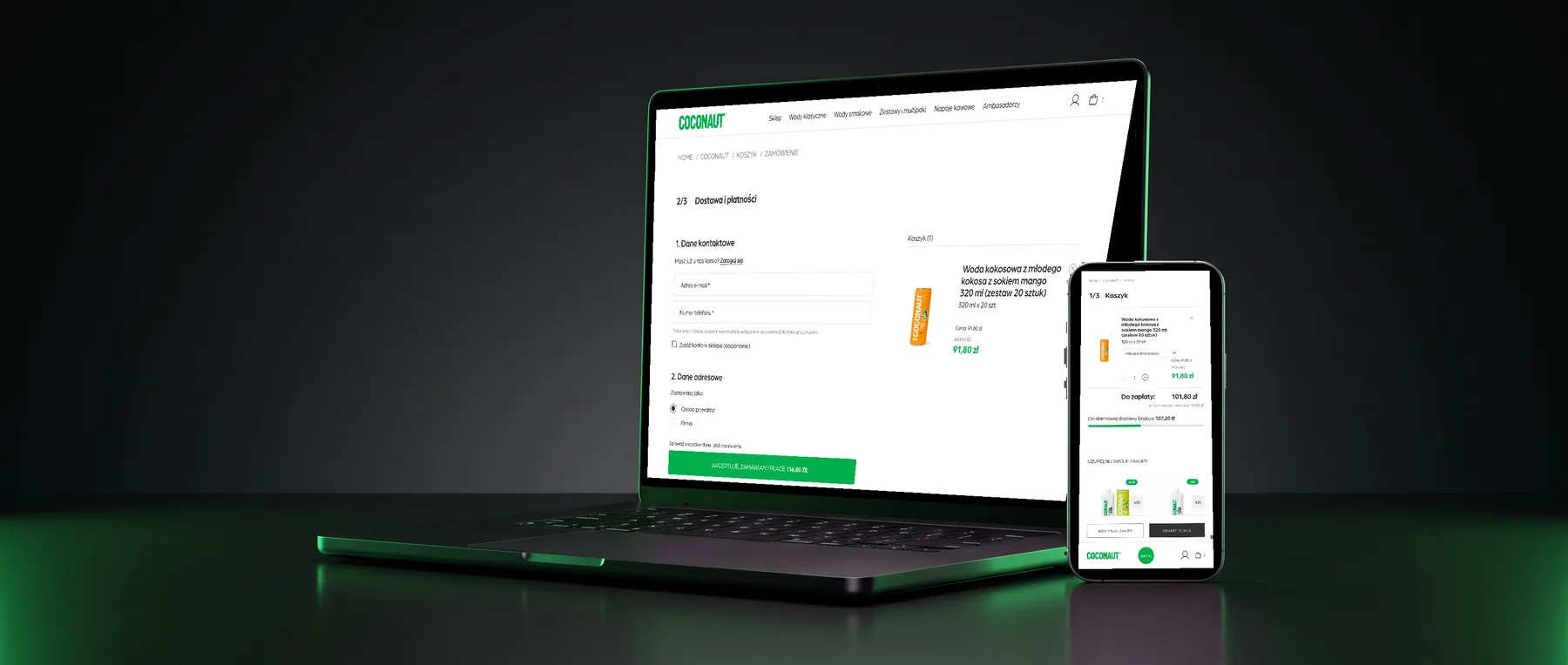
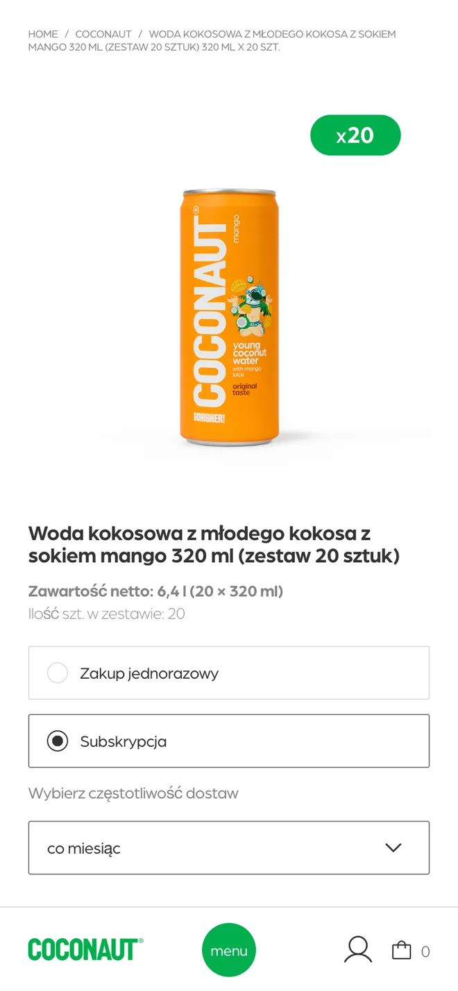
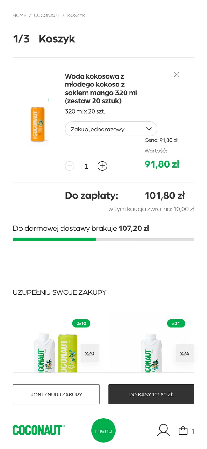
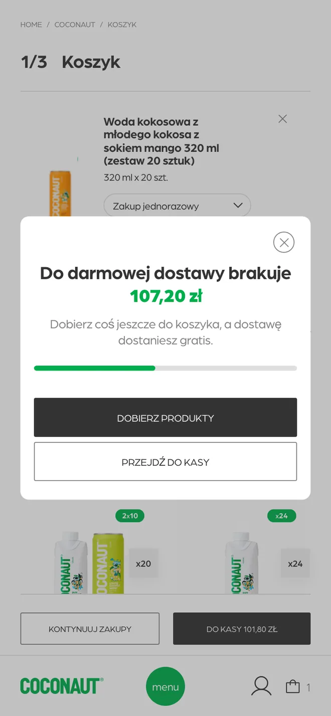
- No surprises at the checkout. The deposit is shown on the product page, the cart counts it as a separate line, a bar shows how much is missing to free delivery and a short nudge appears before the checkout if the customer is just below it. Subscription or one-off can be changed for each product, right in the cart.
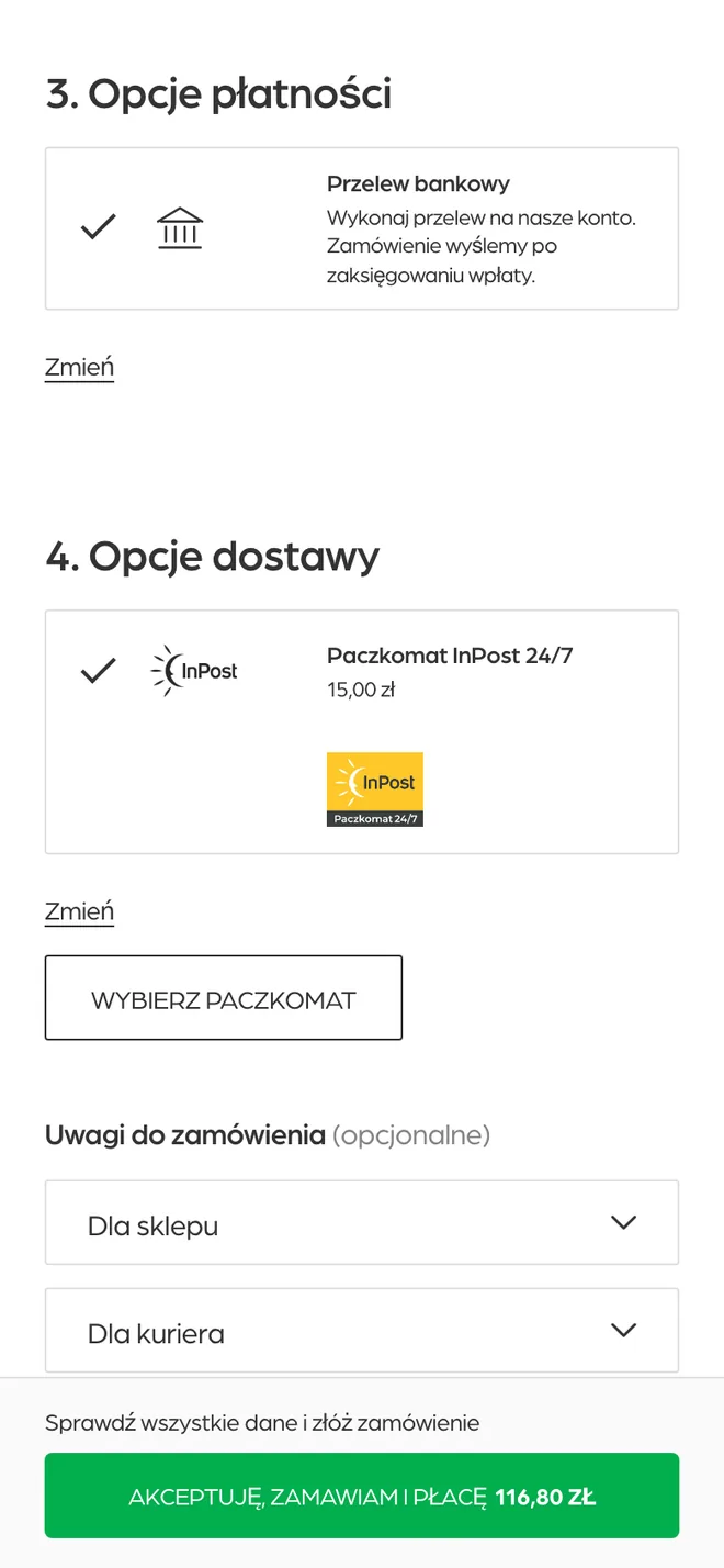
- Nothing changes behind the counter. Every order is reshaped on its way to the order system so it looks like an order from the old shop: the deposit as separate items, invoice details, the chosen parcel locker. The tracking number comes back to the customer’s account on its own.
03 - Who it’s for
Built for people who drink it every week - and the team that ships every case.
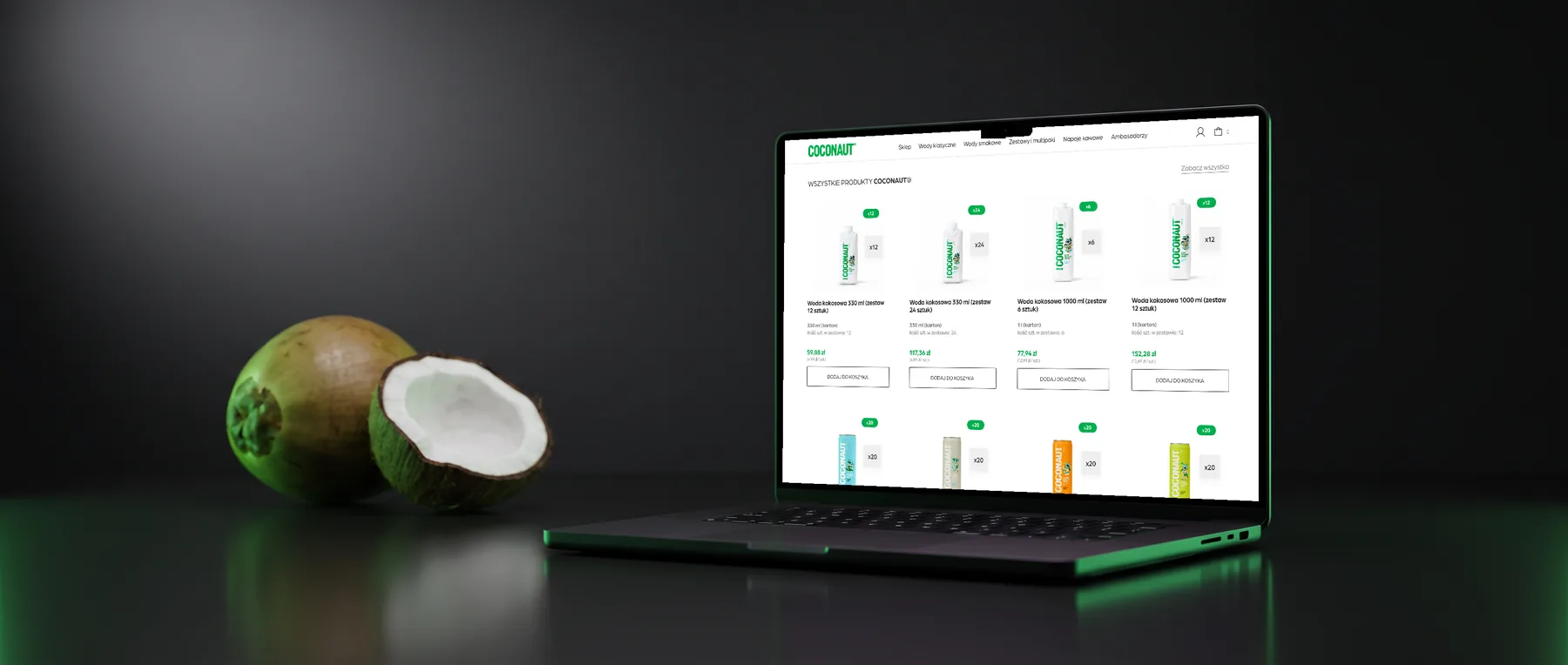
Regulars
They drink it after training or every morning. One click on the product page and the same case arrives every week, two weeks or month - at a better price.
Companies and offices
They buy on an invoice. The checkout asks for a company name and tax number in the right place, so the order system issues the invoice without anyone retyping it.
Readers from search
They land on a blog article or an old shop link. All 33 articles kept their addresses, and old shop and website links lead to the right new page.
The COCONAUT® team
Edits names, descriptions, ingredients and prices once, in the order system - the shop follows on its own. Photos, categories and the homepage are edited in the shop.
04 - Technology & the challenge
A custom shop on a proven platform - and an order that has to look like it came from the old one.
The shop runs on a widely used e-commerce platform with a theme written from scratch for the mockups - no page builder. The homepage is put together from a few blocks the team can rearrange, the hero lets them pick a photo and where the headline sits on desktop and mobile, and one product card is reused on every list, so a change in one place shows up everywhere.
The hard part was invisible. Each product sold on subscription has a hidden twin that follows its price, so a subscription is a real recurring order and not a note on a one-off one. The deposit is calculated from the number of cans and bottles in a pack, stays out of the tax, survives every subscription renewal and travels to the order system as separate items - because that is how the order system expects it. And because an order lost between two systems is the worst kind of bug, a watchdog checks every 15 minutes that each new order arrived in the order system with the same amount, and emails the team if it did not.
05 - The workflow
Design. Build. Connect. Move.
The shop was built screen by screen from the designer’s mockups, desktop and mobile, and went up on a preview site from the first week. The whole purchase path followed - product page, cart, checkout, thank-you page, customer account, returns and subscriptions - then the deposit and the legal changes after the client’s food-law review. The client left feedback straight on the preview site, pinned to the exact element, and each round was fixed and checked on both screen sizes. Then came the connection with the order system, tested end to end on a test channel, the real catalogue, the blog and the ambassadors’ pages moved from the old website, and redirects for every old address.
06 - Feature highlights
Every number on the screen is already the right one.
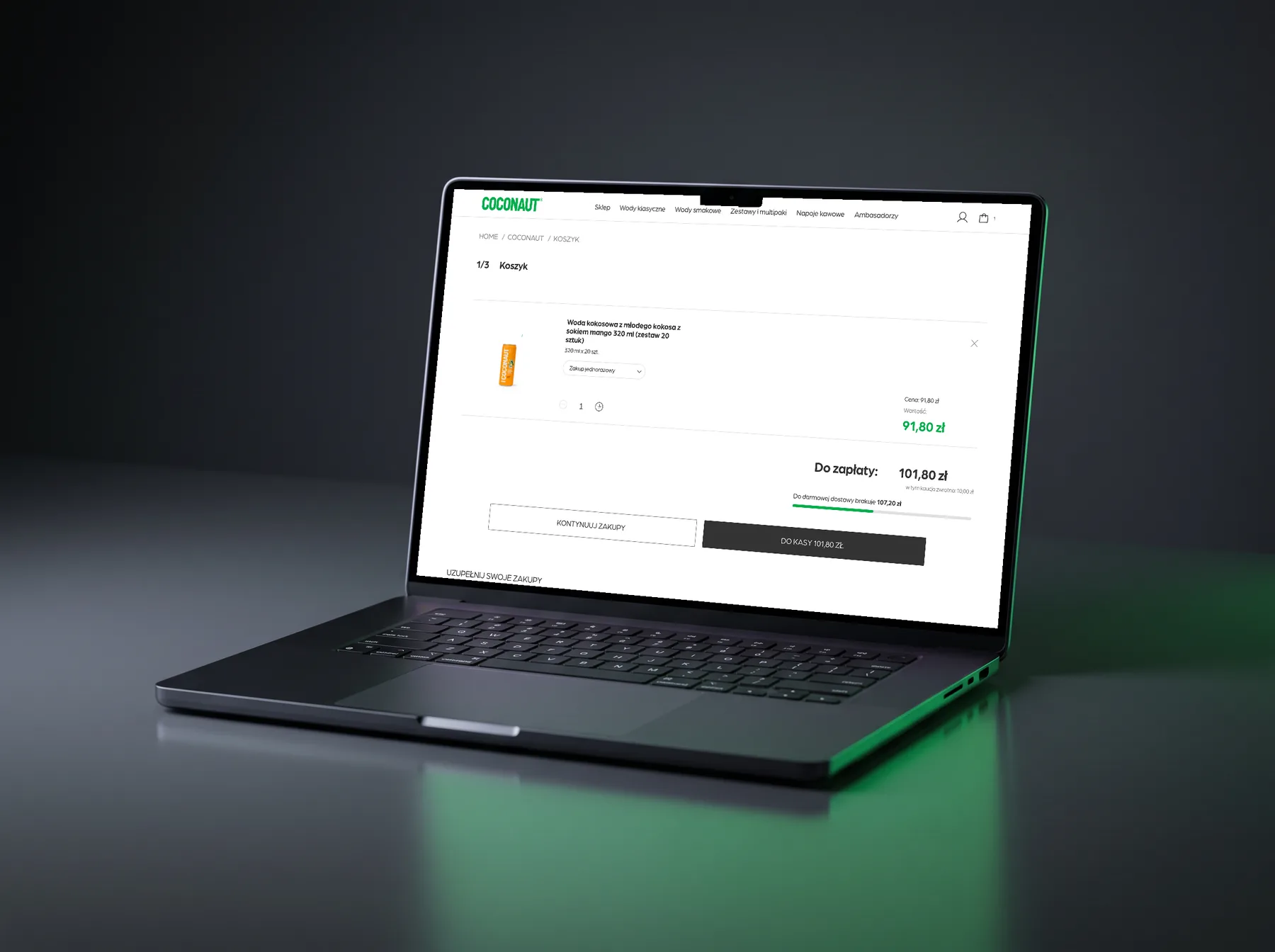
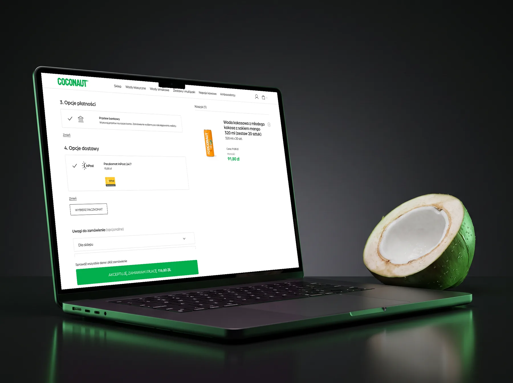
The cart, the side cart and the “to checkout” button show the same amount due, with the deposit and the subscription spelled out underneath, and the checkout adds only the delivery - so the amount on the green button is never a surprise.
+ Returns built for the shop
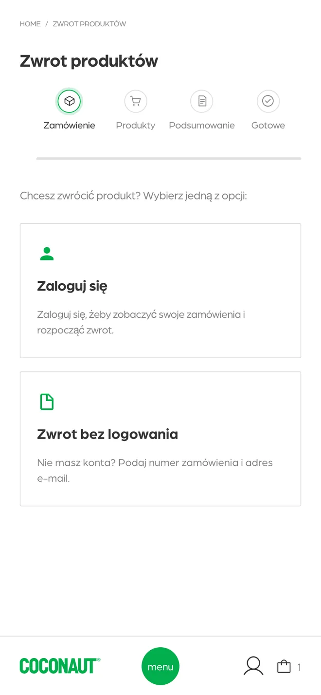
A returns form in a few steps, for customers with an account and for guests, with its own order statuses and emails - plus a “withdraw from the contract” link in the footer, on the thank-you page, in the account and in order emails, as the legal review required.
+ Accessible by default
The menu and the side cart keep the keyboard focus inside while they are open and give it back when they close, focus is always visible, buttons and links have clear names, and the shop has its own accessibility statement.
07 - Results
Ready to take over coconaut.com.
The new shop runs on a preview site with the real catalogue from the order system, subscriptions, the deposit and parcel lockers, and it has been tested end to end with a test channel of the order system. The next step is the switch: the new shop takes over coconaut.com, and the old shop and website redirect to it.
Like what you see?
Let’s build the next one.
From a blank page to a working product - AI, automation, full-stack engineering. Get in touch and let’s talk about your idea.